


Visual Identity of Timareh
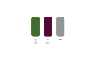
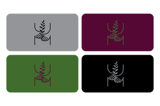
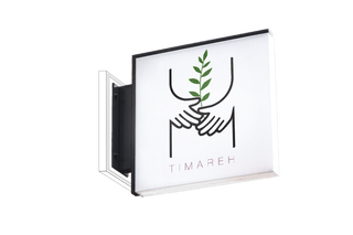
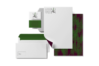
Timareh, derived from the Persian word "Timar," meaning care and nursing, is a brand dedicated to the healthcare and well-being sector, operating across various fields within the industry. In designing the brand's visual identity, I aimed to convey concepts of empathy, care, and human connection. The Timareh logo features two hands gently holding a growing plant, symbolizing support, growth, and a commitment to physical and mental well-being. The brand’s primary color palette consists of green, black, burgundy, and silver—each representing stability, professionalism, trust, and modernity. Beyond the logo, the brand's identity extends to a complete stationery set, including business cards, letterheads, envelopes, and other corporate materials, ensuring a consistent and cohesive visual presence. This design was crafted to establish a strong, trustworthy, and reassuring visual identity for Timareh, leaving a lasting impression as a professional and compassionate brand in the healthcare industry.